All projects
Wordcoder Website
Areas:
UI/UX Design
Copywriting
Tools:
Wordpress, Figma, Photoshop
Client
Wordcoder
Year
2025
Summary
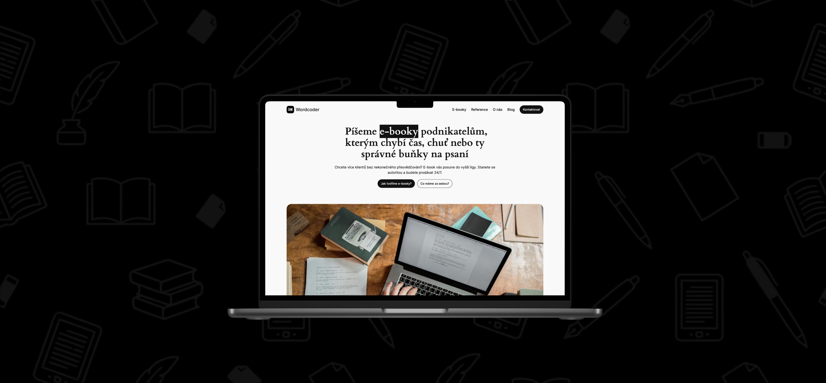
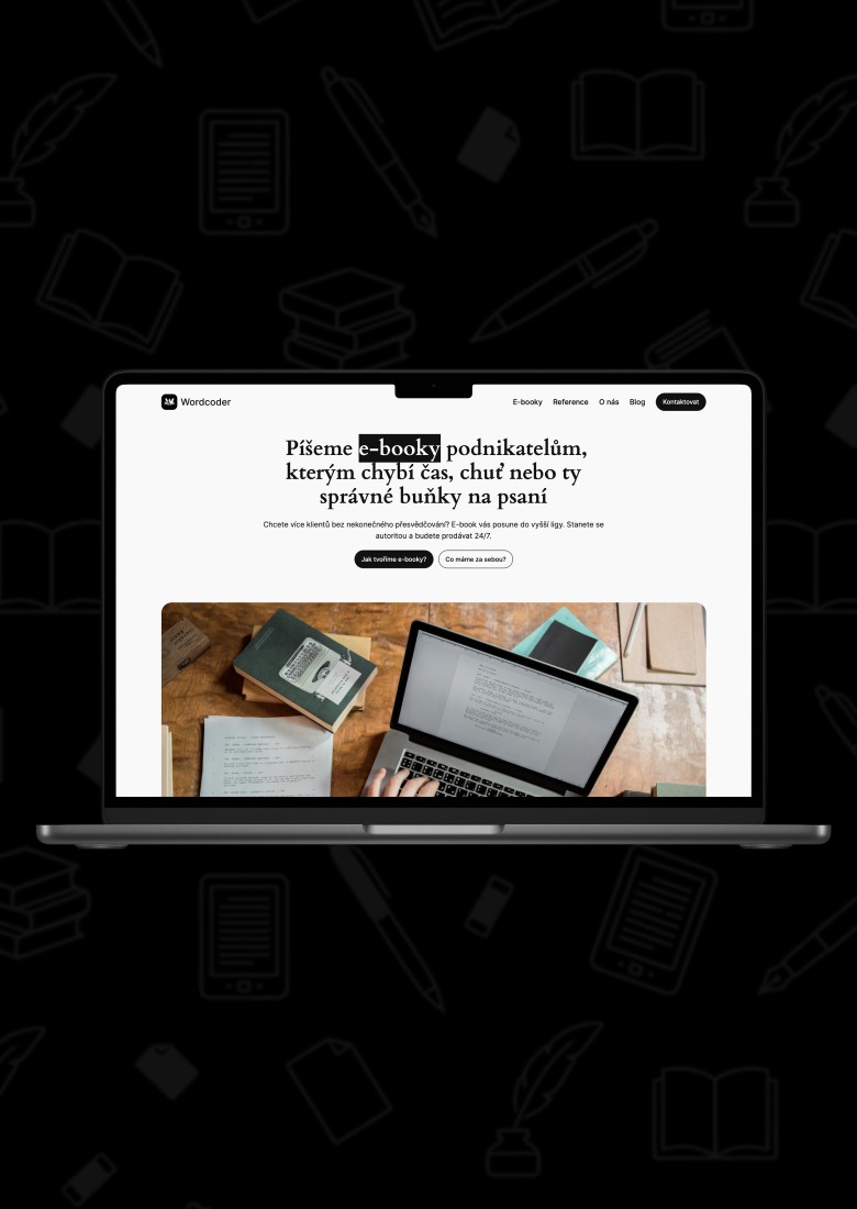
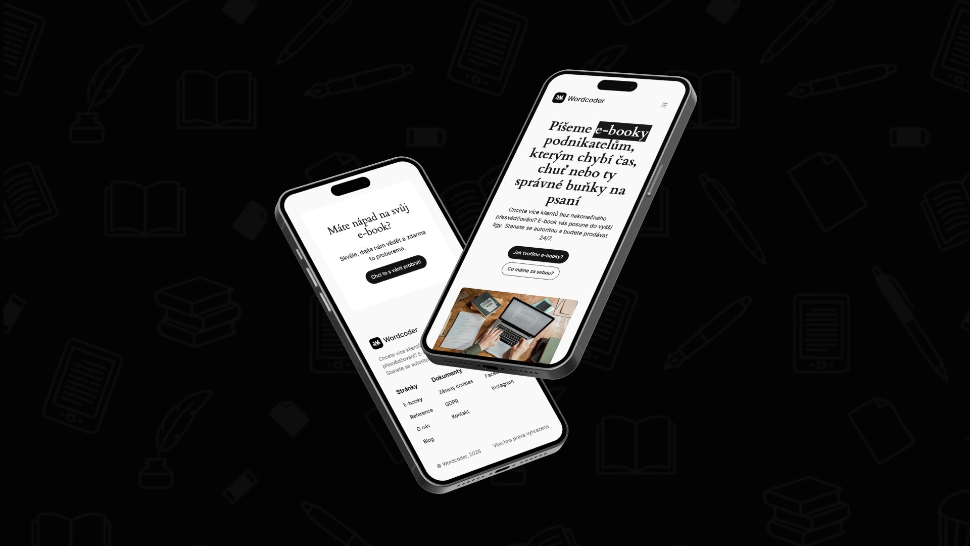
The project included the design of a modern logo, a partial visual identity, and the creation of a responsive website that clearly communicates the company’s focus on professional copywriting and e-book production. The primary emphasis was on simplicity, readability, and a clear content structure, so that the website would effectively showcase the company’s services and encourage conversions from potential clients.
About
Wordcoder is a company specializing in professional copywriting and comprehensive e-book production. These e-books serve as an effective marketing tool for building brand authority and attracting new clients. The company helps its clients transform their expert know-how into valuable digital products. When creating content, it emphasizes a data-driven strategy, the principles of sales psychology, and maximum readability of the final text.
Problem
The project brief was to create a logo and a website, and, as part of that, to design a basic visual identity that would clearly represent Wordcoder’s focus on copywriting and e-book creation.
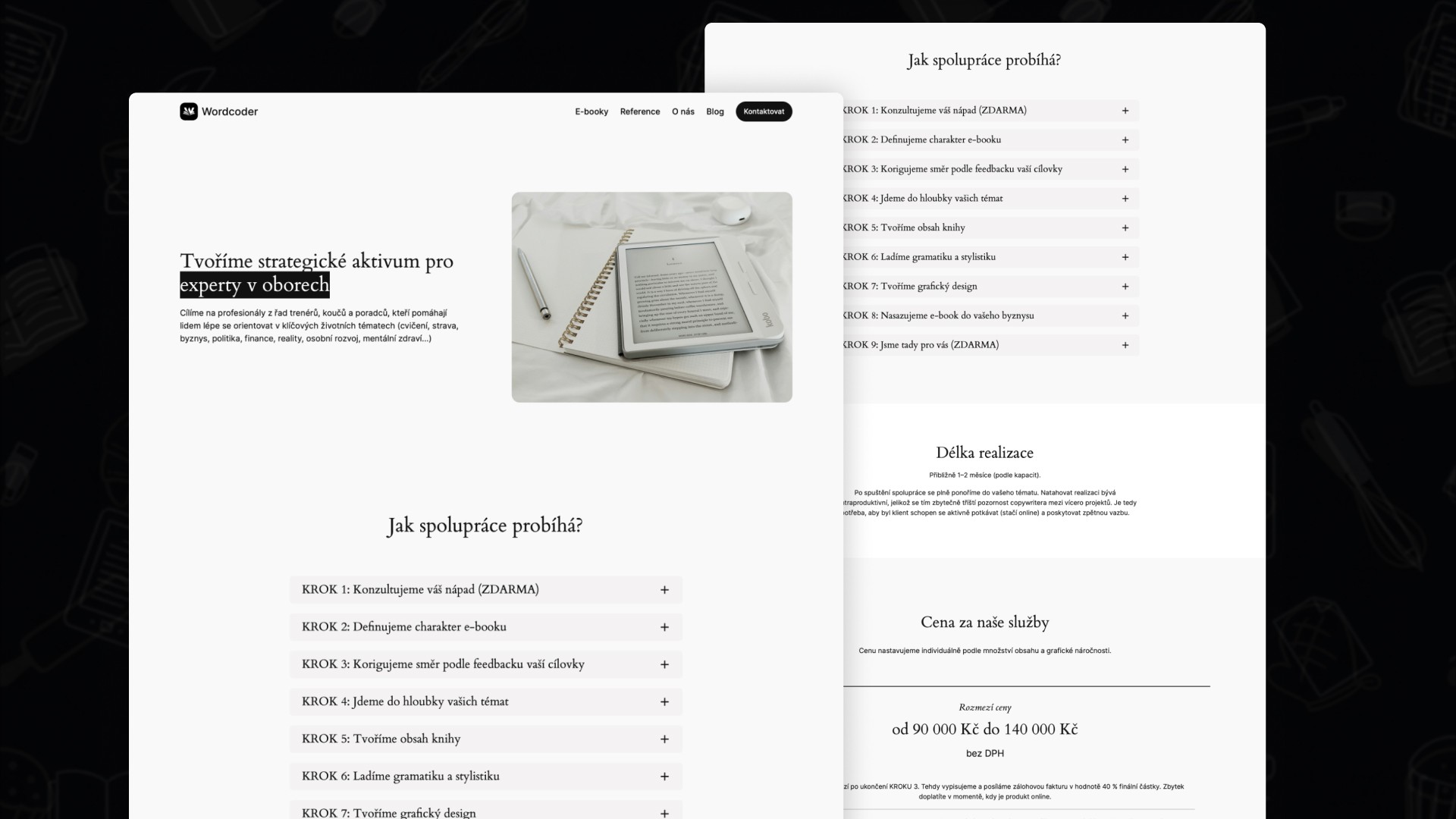
One of the main requirements was maximum simplicity and visual clarity. For this reason, the color palette was strictly limited to black and white. This limitation was not accidental—the goal was for the visual style to resemble the interface of an e-reader. As a result, both the website and the logo evoke a digital reading experience and reinforce the brand’s core concept: working with text.
The challenge, therefore, was to create a minimalist yet functional design that would highlight the company’s expertise in text creation and ensure that the user’s primary focus always remains on the content.

Solution
A logo was designed for the Wordcoder brand based on a stylized letter W, which references the company’s name. The logo’s shape also visually resembles an open book or spread pages, symbolizing the company’s main focus—working with text and creating e-books.
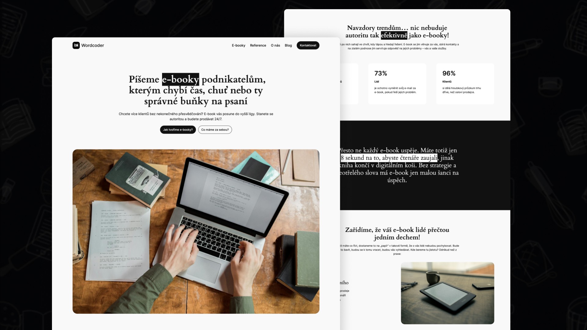
The website is divided into several main sections:
Landing Page – the home page, which presents the main concept of the project and introduces visitors to the company’s services
E-books – a page explaining the e-book creation process and presenting the company’s main service, including pricing
Testimonials – an overview of completed projects and case studies
About Us – an introduction to the company’s founders and their motivations
Blog – a space for expert articles and content marketing
Contact – a contact form and ways to get in touch with the company
Legal Pages – legal information and documents
The entire website was built on the WordPress platform.
The project also included:
setting up Google Workspace for corporate communication
implementing Google Analytics and Google Search Console
securing the website
configuring user access and system administration
Results
The project resulted in:
a consistent and minimalist visual style that represents the Wordcoder brand
a modern and user-friendly website focused on converting potential clients
a logo that visually links the brand’s identity to the theme of working with text and e-books
Key Takeaways
One of the main challenges of the project was to create a visually appealing website using a very limited color palette. The minimalist black-and-white style required an emphasis on typography, content hierarchy, and careful layout of individual elements.
Another challenge was to design the website’s structure so that the content would be understandable to both new visitors and potential clients who are just becoming familiar with the concept of e-book creation.
The project thus provided valuable experience, particularly in the following areas:
designing minimalist design systems
creating content-oriented websites
aligning visual identity with a brand’s product or service