All projects
William & Thomas Bakery
Areas:
UI/UX Design
E-commerce
Tools:
Figma, Photoshop
Client
Quanti s. r. o.
Year
2025
Summary
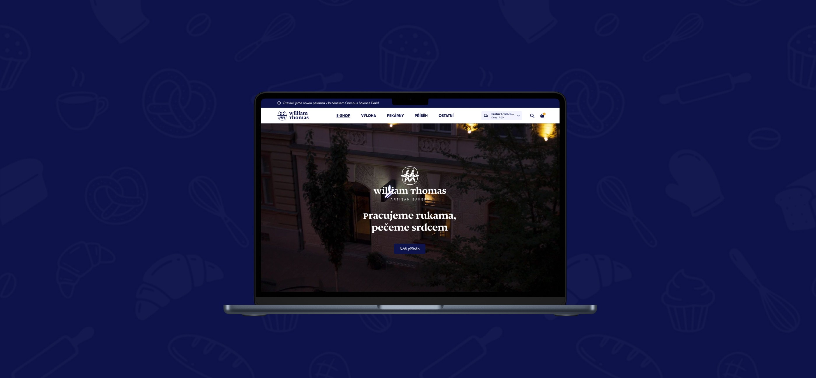
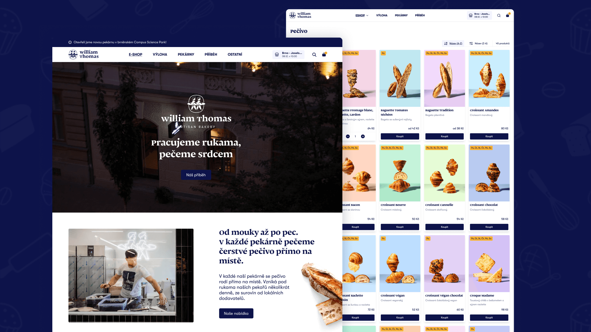
This project is a complete redesign of the William & Thomas Bakery e-commerce website, with the goal of creating a modern and intuitive online environment for purchasing baked goods. The new design builds on the brand’s existing visual identity and respects its artisanal character, while also being more organized, scalable, and user-friendly.
About William & Thomas Bakery
William & Thomas Bakery is a chain of artisan bakeries inspired by French tradition, with locations in Brno and Prague. The bakery prides itself on using high-quality ingredients from local suppliers and adhering to traditional production methods. As a result, the baked goods—which are prepared on-site throughout the day—have the taste of fresh Czech butter and nutritionally rich flour from Czech fields.
Problem
The original William & Thomas Bakery e-commerce website functionally met the brand’s basic needs, but from a user experience perspective, there was room for significant improvement. The main navigation and hamburger menu contained items that could have been better labeled and organized more logically. Some key features typical of modern e-commerce, such as product search or stock availability filtering, were either missing or not implemented in a sufficiently user-friendly manner.
Another area in need of improvement was the website’s visual design. The color scheme and contrast needed to be standardized and adjusted to better meet current accessibility standards. The checkout process and shopping cart flow needed to be simplified and made more intuitive so that users would have a clearer understanding of each step of the order process.
The goal of the redesign was therefore not to completely overhaul the original concept, but to build on the existing solution, preserve its strengths (particularly in terms of visual design), and at the same time eliminate friction points that could negatively impact the user experience.
Solution
A comprehensive UX/UI solution encompassing more than 20 screens was designed for William & Thomas Bakery. The overall design was based on a UX analysis conducted by Quanti’s UX department and on a summary of client requirements that emerged from meetings held directly with Vilém and Tomáš, the founders of William & Thomas Bakery.
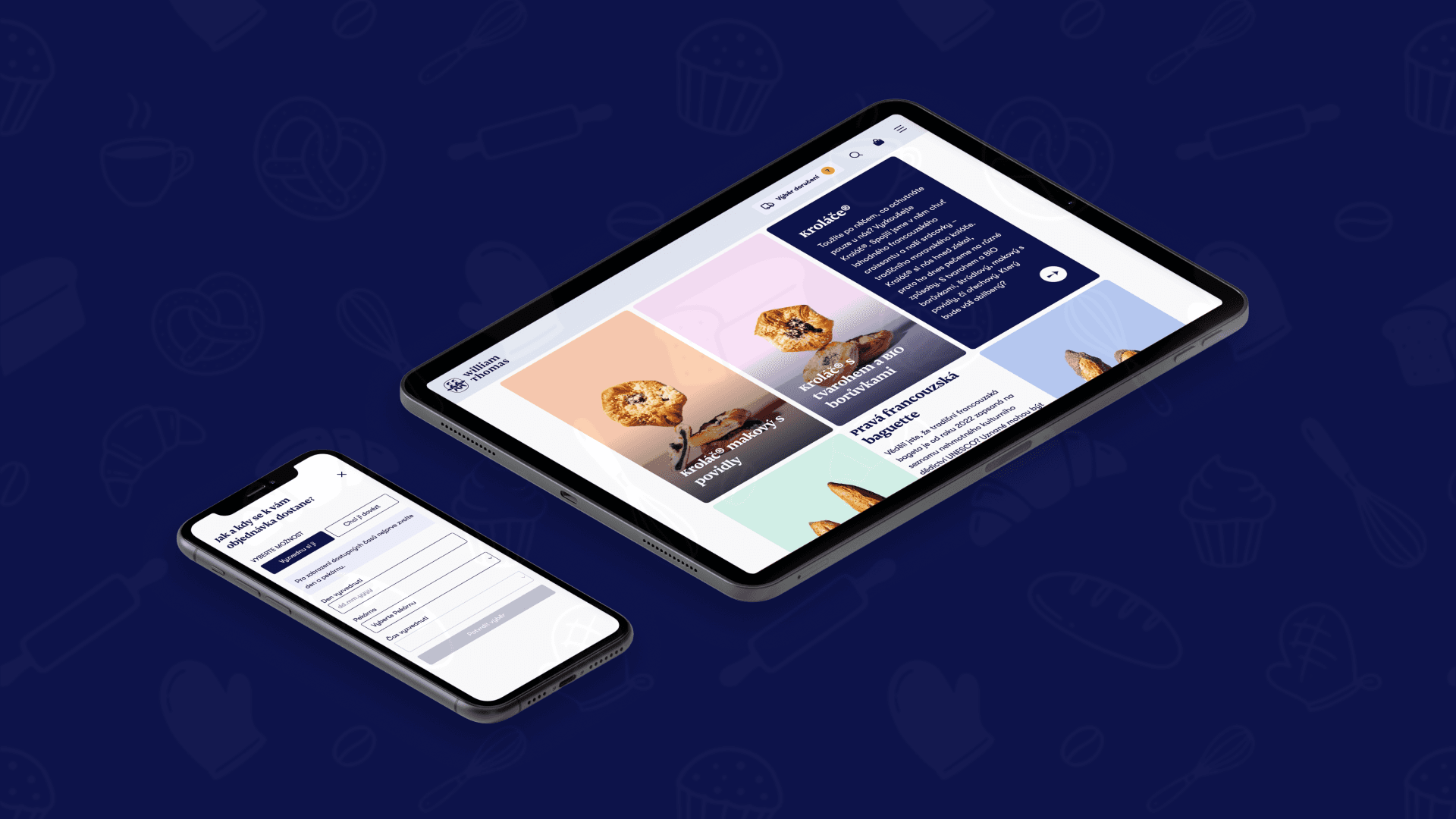
The final design is built on a clean, modern interface with soft pastel colors that highlight the bakery’s artisanal character. The website’s structure is designed so that users can navigate naturally and intuitively—much as if they were walking through an actual bakery. Part of the solution is, for example, the “Showcase” page, which doesn’t pressure users into making an immediate purchase but allows them to browse the entire William & Thomas Bakery product lineup at their leisure.
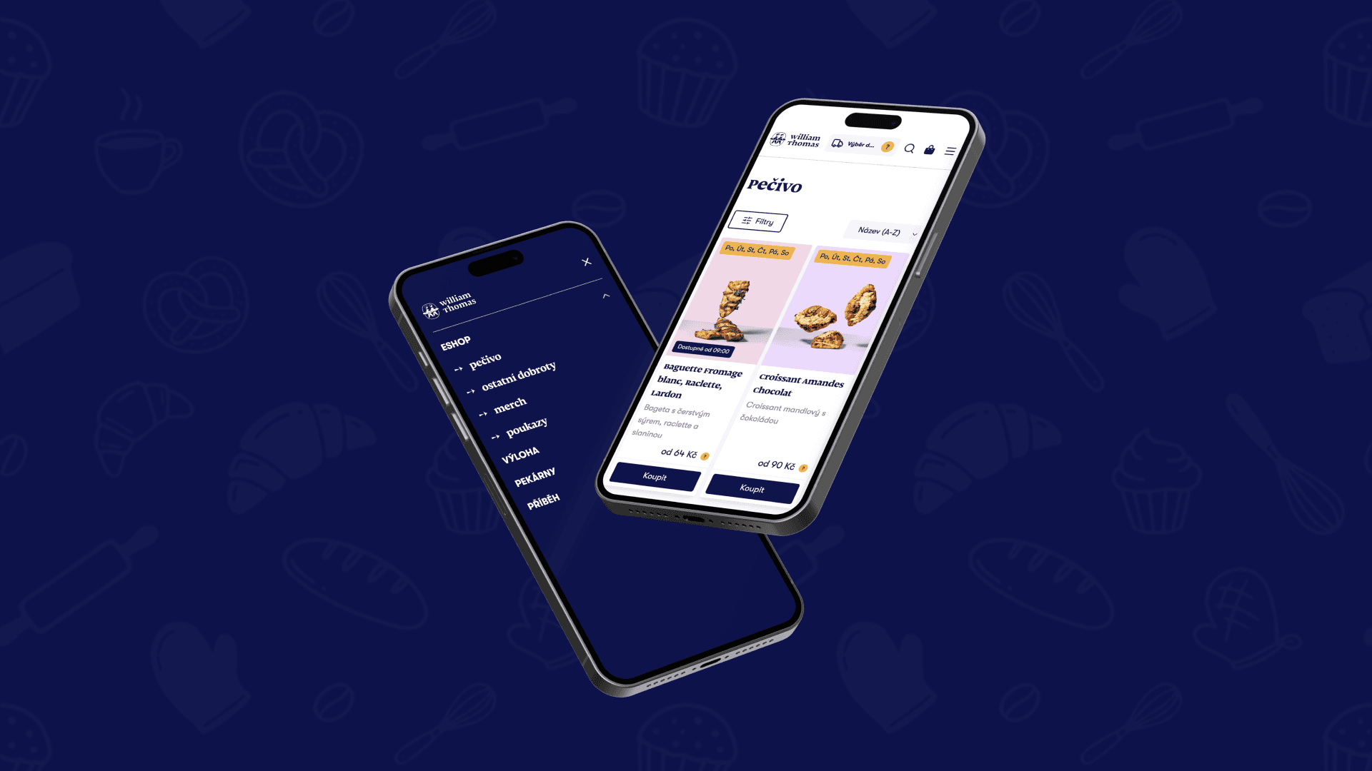
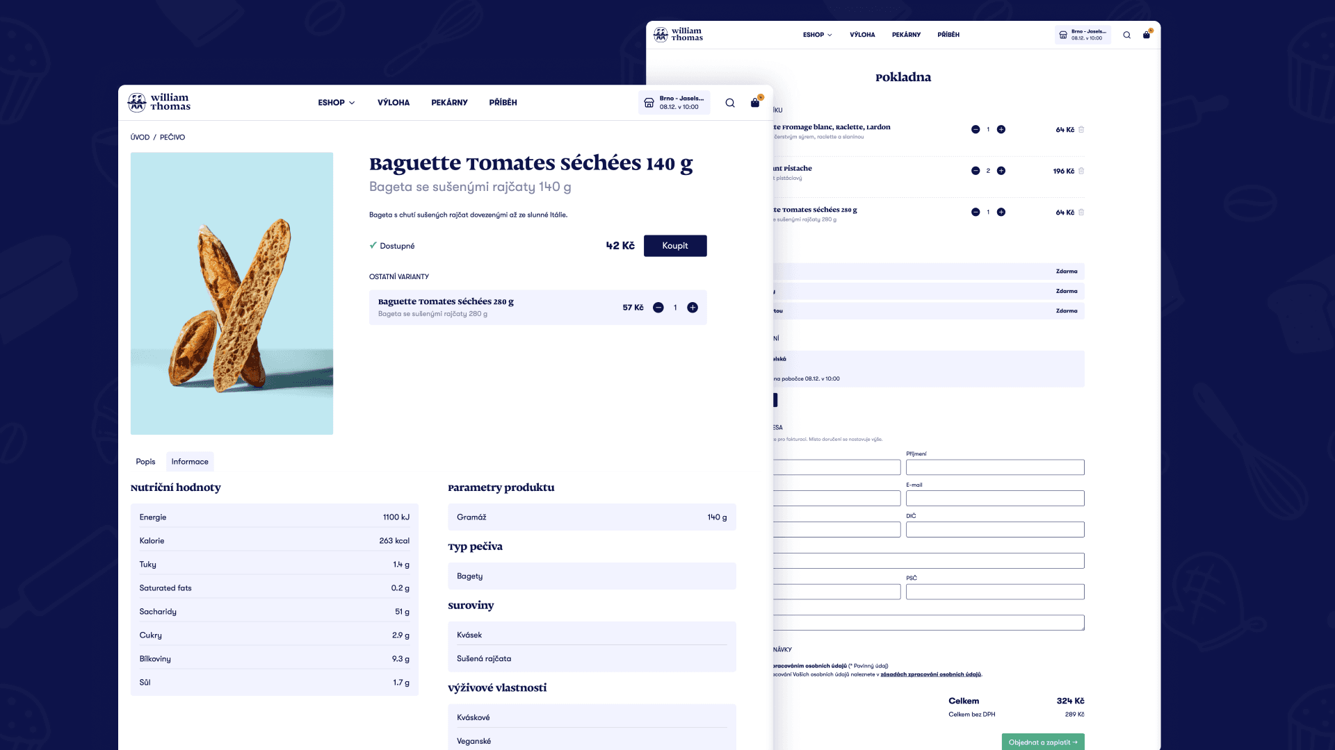
The product page is designed to clearly present the wide range of products and allow users to easily select and add their desired variant to the cart. The product detail page provides all key and supplementary information, including the product’s ingredients and a display of recommended similar items. The checkout process is transparent and straightforward, and users have a constant overview of their order contents, prices, and each step of the purchase.
The redesign also included smaller but important UX improvements aimed at simplifying users’ decision-making. For example, a new shipping selection widget located directly in the main menu allows customers to immediately set the delivery location and method for their order without having to navigate through several submenus or pages. When changing the delivery location or method, an overview of price differences between individual branches is displayed. These micro-interactions help reduce uncertainty and set the right expectations early in the purchasing process.
Results
The result of the redesign is a modern e-commerce solution that offers:
an intuitive and seamless shopping experience
significantly improved navigation and clarity
a clean, uncluttered visual environment in line with the brand guidelines
an accessible interface that meets contrast standards
a consistent user experience across devices
The website now not only supports online sales but also strengthens customers’ connection to the brand and its values.
Key Takeaways
The main challenge of the project was its complexity. It was a large-scale e-commerce website with a large number of screens and interconnected features. It was one of the most extensive projects I have worked on to date, and it required meticulous organization and consistency across the entire interface.
Another challenge was my partial involvement in the actual development of the front-end interface. This allowed me to be more closely involved in the technical implementation of the design and gain practical experience with design implementation, including working with the Tailwind CSS framework. This cross-functional role helped me better understand the limitations and possibilities of development and design solutions that are not only visually appealing but also realistic and effectively implementable.
The project provided me with valuable experience in designing complex e-commerce solutions, collaborating with the development team and other designers, and translating the design into a functional digital product.